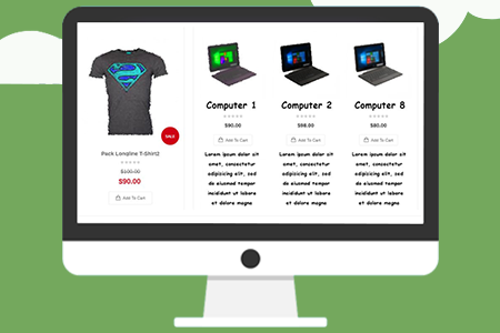
These days there are multiple E-commerce websites sprouting around the web. The ease with which a driven entrepreneur can realise his dream of selling his product has allowed the industry to mushroom exponentially. Though there have been many pitfalls with multiple start-ups falling to generate any revenue and subsequently shutting shop.
Designing UI/UX is essentially a problem-solving approach specific to design, which involves assessing known aspects of a problem and identifying the more ambiguous or peripheral factors that contribute to the conditions of a problem. Failing fast in a test group and environment is the best way to achieve the required design for user interface and user experience (UI) and (UX).
If for brick and mortar store it was location, location, location and store, store and store for e commerce it is UI, UI and UI and UX, UX and UX.
How to spot that if your UI/UX design is hurting your e commerce business
-
High Bounce Rate – Bounce rate means the percentage of visitors to a particular website who navigate away from the site after viewing only one page. A high bounce rate indicates that shoppers are not finding what they want or need when they visit product pages on your site. According to Conversion Voodoo, an average bounce rate is about 33% for e-commerce sites. They recommend adding highly detailed product descriptions with lots of information to keep customers engaged.

-
Shopping Cart Abandonment – Customers place an item in their shopping cart, but then they leave without completing the checkout process. This is a common, troubling problem for online retailers.

One of the major problems why some E-commerce websites are not able to attract customers is down to the UI & UX offered. So here is a list of common mistakes to avoid :-
- Creating a Complex Navigation interface :
The navigation interface of any E-commerce website should be simple and intuitive for a user to understand and immediately pick up. It should provide multiple filters and sort options to let the user drill down to the product he is looking for and also include a comprehensive search option. A breadcrumb navigation should be included to always let the user know where they are located and to provide easy navigation route out of the current page. -
Poor quality images and product descriptions.
A bad quality product description would generally be suffering below issues.- The product images are poor quality or take too long to load.
- The descriptions are vague or incomplete (e.g., they lack clear specifications).
- There is no call to action encouraging the consumer to buy.
- You are missing an opportunity to showcase related content that would entice the viewer to stay on your site.
A good quality product description and image ensures that - Descriptions are accurate, complete and engaging.
- Product images are clear and show all important details.
- Content includes enough information for consumers to make an immediate decision.
- Related/similar content is displayed on the page, giving visitors additional options.
How to spot that if your poor quality images and product descriptions are hurting your e commerce business

-
Negative Customer Reviews – it can be eye-opening to discover how many negative reviews focus on inaccuracies in product descriptions. They might look something like this:“What I received wasn’t at all what I expected. The description for the shoes said scarlet but they are basically maroon.”“The sizing on this shirt runs so small, I had to return it and get one TWO SIZES UP! What’s the deal?”

- Refunds and Returns – one of the most common reasons customers ask for their money back is because the product image and description didn’t match the reality. And that’s not just one sale you’re losing. It’s all the future sales from that customer.
- Missing contact information In its second annual survey, the 2015 B2B Web Usability Report, 51 percent of respondents indicated that “thorough contact information” was the key website element missing from most websites. An astonishing 98 percent of respondents said that “No Contact Information / Phone Number” would cause them to leave the website (44 percent) or be so annoyed that they might leave the website (54 percent).
- Not including forum for users or Q&A section
Q&A is user-generated content (UGC). And Google favors UGC (text format, not yet video format) in its search results. Many retailers and brands see a 2:1 ratio of questions to reviews and for some merchants this ratio can be much higher. Since Q&A acts as a living FAQ doc on your product page, it naturally generates an abundance of keywords. Make sure your content is visible to Google; indexed directly on your pages.
The Q&A content is evergreen on one’s site, giving visitors key information to drive conversion. In addition, when a consumer receives an email after the question she asks has been answered, conversion rates between 10 to 40 percent from that answer notification email are typical -
Not Focusing on the product details :
A user tends to trust a website more when the product page offers a full description of the product. It also helps the user make a decision when multiple images are included and detailed reviews from other users are provided. Even if your store prices are lower, a user will be averse to make a purchase if the details of the products are not correct. When related products are displayed and sharing options are provided there is a greater chance of diverting more traffic to other products and your site in general.
- Confusing Content with Call to Action links :
Every Call to Action link should be prominent and separated from content using whitespaces, colours, and size this allows a user to see the next step to follow in a glance. Call to Action links should not have ambiguous titles but instead accurately describe the next step in short (ex- pre-order). Primary and secondary Call to Action links should be clearly differentiated as for example ‘Checkout’ and ‘continue shopping’. - Complicated Checkout process :
The checkout process for any E-commerce site should be streamlined. The user should be able to clearly see the shopping cart from every page of the site. The Cart should include all fees including shipping to remove any ambiguity and should allow customers to place an order without creating an account. The whole process should be designed to ensure fastest completion time.- To Improve Your Checkout Process:
- Make checkout mobile-friendly
- Use a progress indicator
- Be generous with payment options
- Don’t require membership or login
- Put security features everywhere: A leading cause of abandonment is a distrust of payment security. As online retailers, we need to make sure that every step of the checkout process features trust signals — indications that the customer’s payment information is absolutely secure. The method of assurance you provide is not as important as the fact that you are providing assurance. For example, few people have heard about “thawte” (Teleflora’s badge), but they know what “secured” means, and they know what a padlock indicates. Further, they know that that style of symbol usually means that there are security measures in place on the site. This gives them the confidence that they need to go forward with the purchase.
- Request only the essential information: Endlessly filling out forms is the bane of many online shoppers. They don’t enjoy it. In fact, generally speaking, the less you ask for, the more they will be likely to buy

- To Improve Your Checkout Process:
- Hidden Fees
Hidden fees especially when it is not an industry trend will result in trust issues by customers and is generally bad customer service. Like in financial industry fixed percentage of investments are marked as fees but generally not mentioned upfront. Sometimes on web sites taxes etc are not added to products but appear only when final payment is to be made. This can result in no repeat customers and bad word of mouth which can be lethal for the survival of the start up. - Big screen, small screen
It is always advisable to have a mobile apps for your website but for start up and small ecommerce businesses this could mean overhead costs in maintaining apps as well as websites for mobiles and desktops. Most of the websites are created to be rendered on Desktops but with proliferation of smart phones as well as smart phones becoming the primary source or device for surfing a start up needs to ensure that its websites are rendered effectively and efficiently on both the mediums. -
Customer do not know what to do :
According to the Nielsen Norman Group, most users stick around less than 59 seconds. So, if you don’t capture a users attention in less than a minute, you’ve lost them. Basically, if you haven’t generated interest or made a pitch in 59 seconds, then customers would not know what to do and will leave website for good.
- No Mention of Shipping & Return Policy, and Contact Information :
Prominent display of the Website’s shipping & returns policy Instils a sense of trust in the customer as there is no ambiguity on any of the terms of the transaction. Also the customer is emboldened that on encountering any problem he can easily contact the company support to resolve the issue when the contact information is displayed in an accessible place.
No matter the amount of money spent on SEO, SMO, and other marketing initiatives, if a website does not follow the above tips then it is doomed to failure from the start. The biggest Marketing tool is word of mouth and a good UI & UX facilitates this and helps any entrepreneur to achieve his dream.
